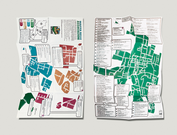
Formigine, a lovely town in the province of Modena, counts thirty thousand people and one hundred and thirty associations. My (not so strong) proximity to the social and political world has often led me to work on projects about the volunteering reality. One of these projects, maybe one of the few remarkable ones so far, was the Map of Associations, a flier which was a sort of Vademecum that described all the associations of Formigine.
Even if for reasons unknown the municipality didn’t give prominence to the project at stake (and I didn’t get a penny for its realization, editor’s note), it must be said how complex and interesting the work has been.
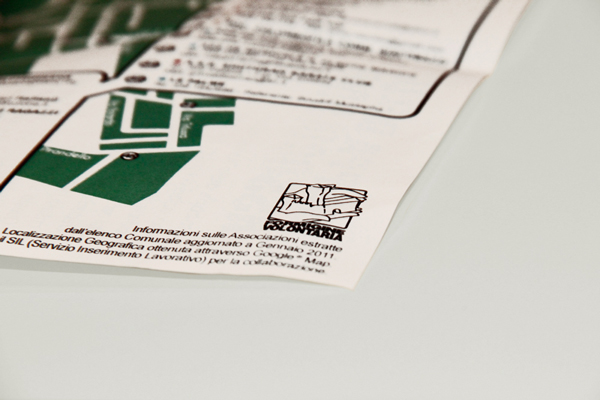
Apart from the Logo and the naming for it, the hands holding the castle as symbol of belonging to the territory and of mutual solidarity, I think the map project was way more interesting because it brought a greater number of graphic-designing problems.
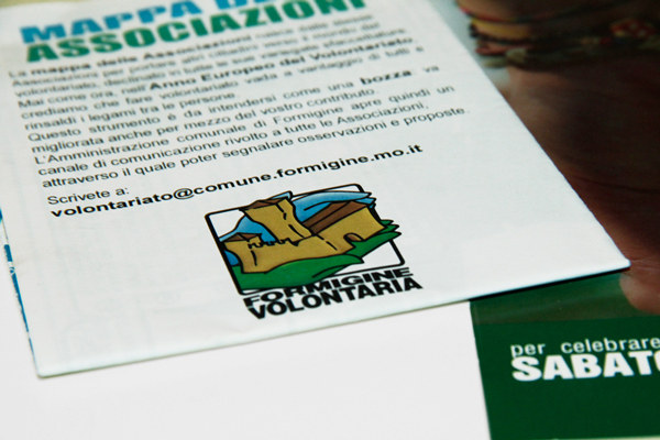
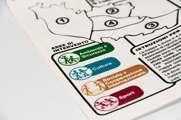
The double-sided A3 format forced me to some extreme choices of summary, therefore I decided to draw a double legend. The first legend was about the type of association, the second one, linked to the color of the map, allowed to identify the different towns of the municipality, which were also represented in a small illustrated map very easy to understand. Associations and institutions had to be named together with their address, phone number and other telematic contact details. Therefore, an additional reduction of the size of the characters used was needed. The result was a mix of information compressed in two pages of 297x410mm.
This project represented for me an exercise of style and summary. It gave me some experience for future projects that I will necessarily have to be paid for (otherwise things will so south).
