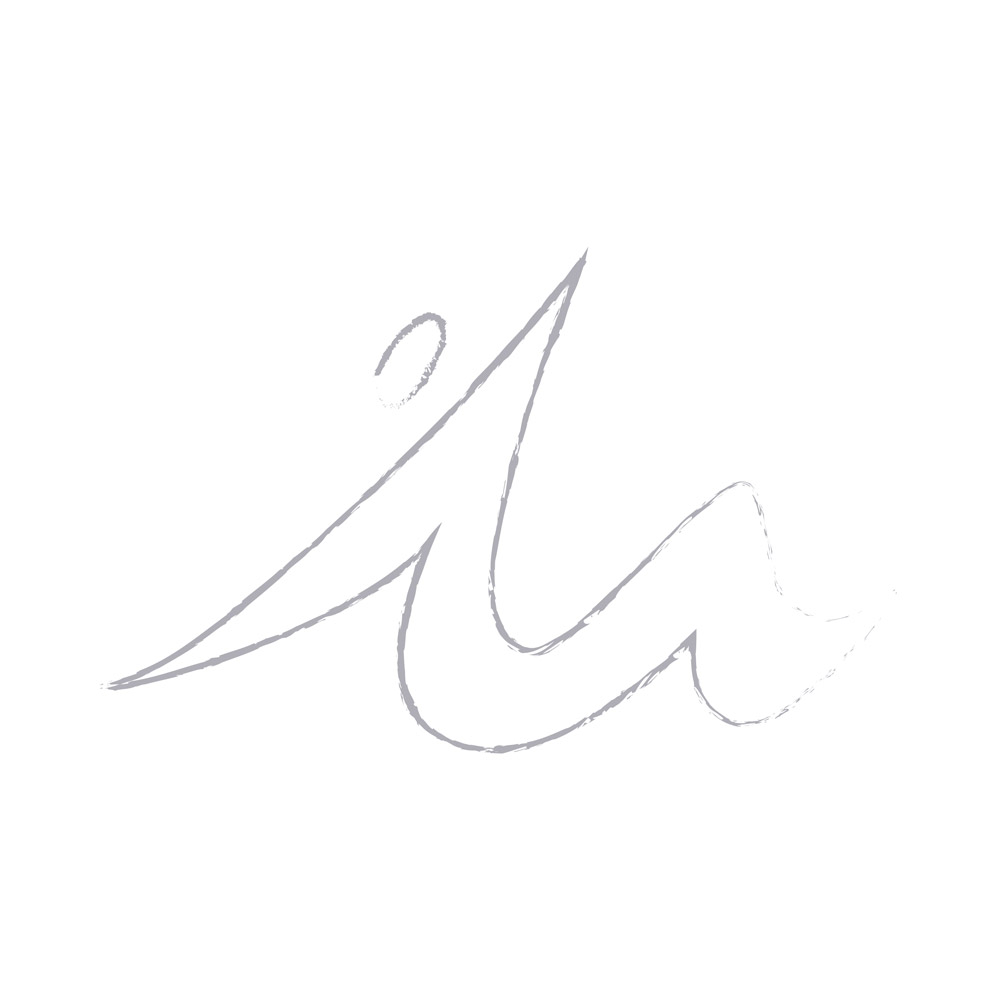
Working for Linda was easy, although fitness, yoga, Pilates and eastern philosophy have never been my bread and butter. The Movimente’s logo was born from a little hunch I had in front of a soy cappuccino when I was in a campsite in Marina di Ravenna, during some nights I’m ashamed of and some days lacking of sleep. Normal things have never been my thing sadly.
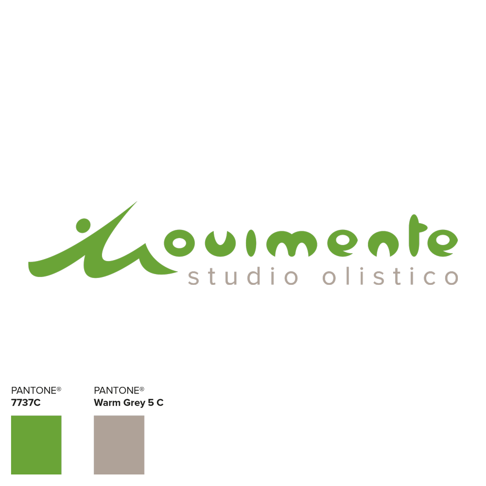
I was looking for a symbol that could immediately recall dynamism and lightness, sporty but relaxed positions, creating sinuous shapes coordinated with the trademark’s text. Doodling all over her name’s initial I got something. Then I reworked and rationalized it until I reached the shape that I had in mind.
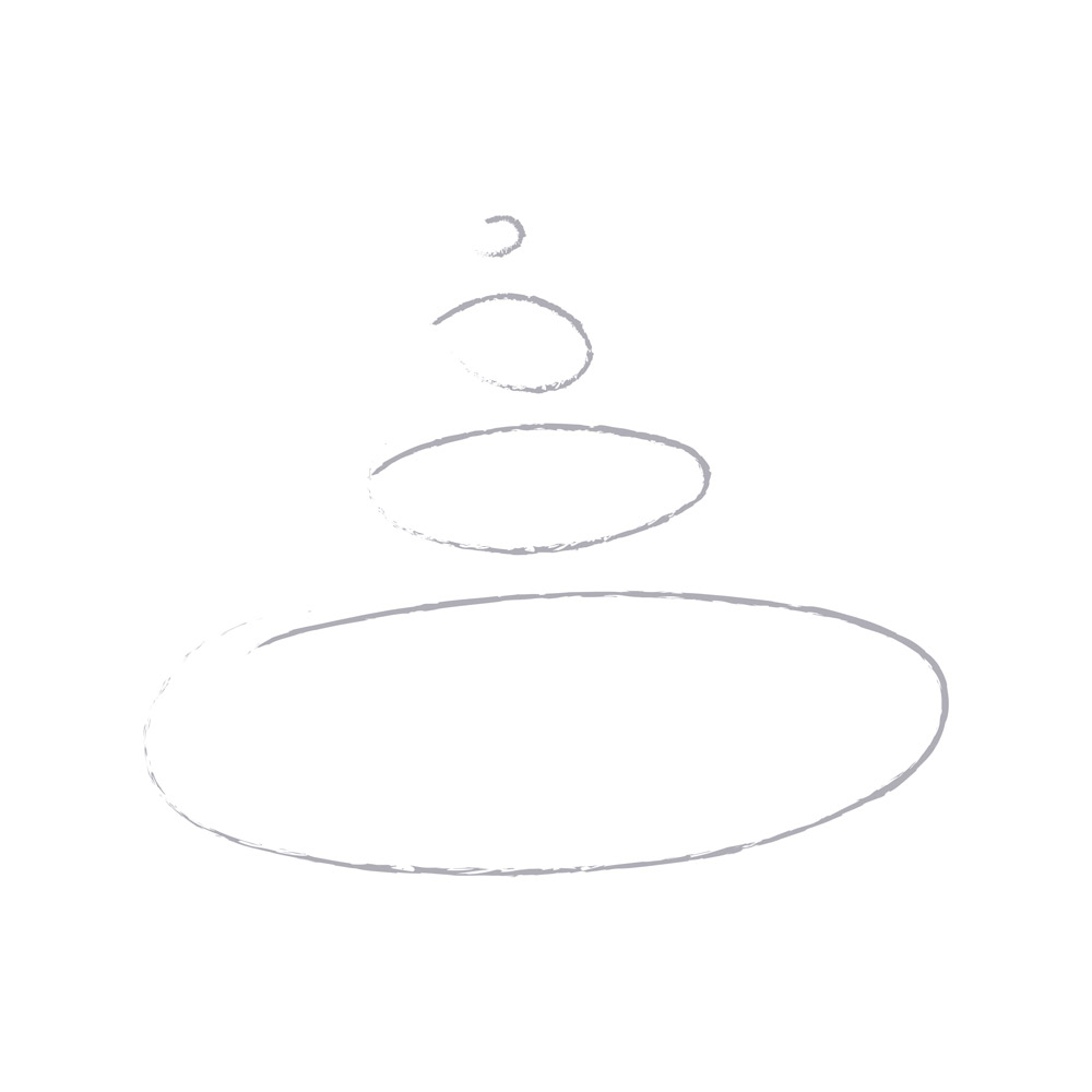
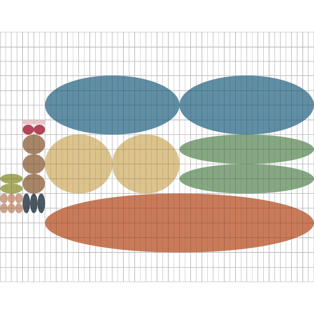
Since the beginning the starting point for the creation of Movimente’s logo was the soft and comforting oval shape. From that, I provided regularity to the logo in all its parts, regulating the shapes and making them balanced with each other in order to create the final logo of the brand.
After finishing the logo, in the middle of a joyous euphoria, Linda decided to entrust me with the creation of a tree to be painted on a wall of the studio. At first, I decided to create a network of people placed in different yoga positions, united in a kind of huge group hug. Then I started to create a series of human figures taking inspiration from the positions of this discipline.
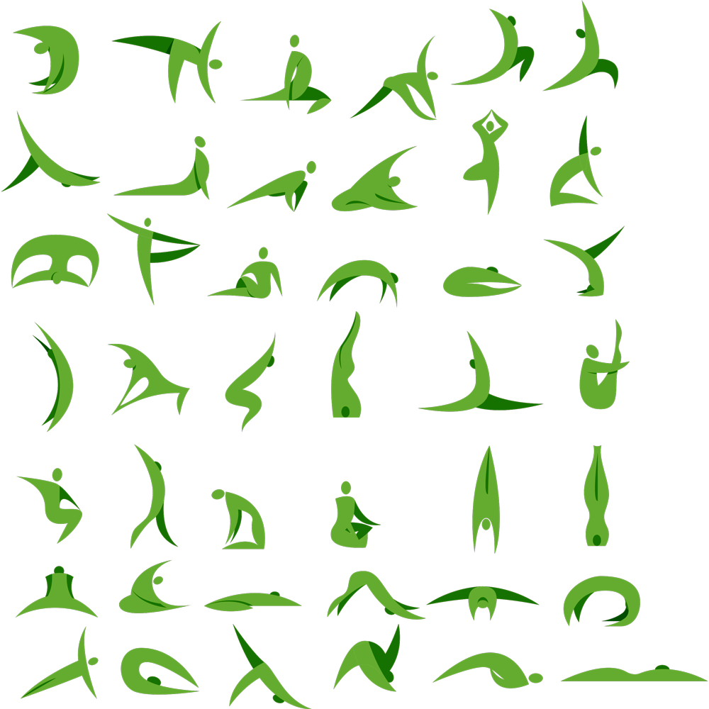
I started by pulling together all these shapes to form a tangled human network to create the tree. However, its complexity wasn’t the best both for an aesthetic and a realization purpose.
In a glimpse of unexpected intelligence, I realized that I could get a much better effect by summing only some of these figures in a larger format. In this way I could obtain a much less elaborate tree. The result was way better and simpler than the previous one (sometimes beautiful things are also the easiest ones…).

SOMETHING ELSE?
Yes. Linda and I didn’t stop. We developed other pretty things for her events’ communication. We wanted to attract all the people in need of sport and wellness to her gym, which was growing thanks to her constant commitment and her ability to find competent teachers for every discipline together with satisfied customers.
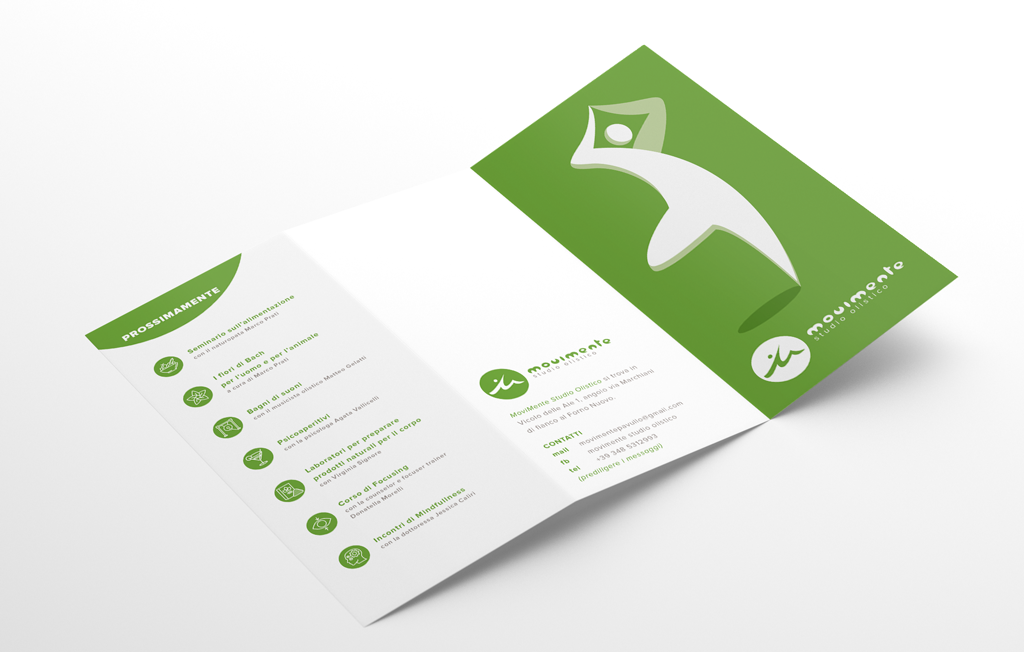
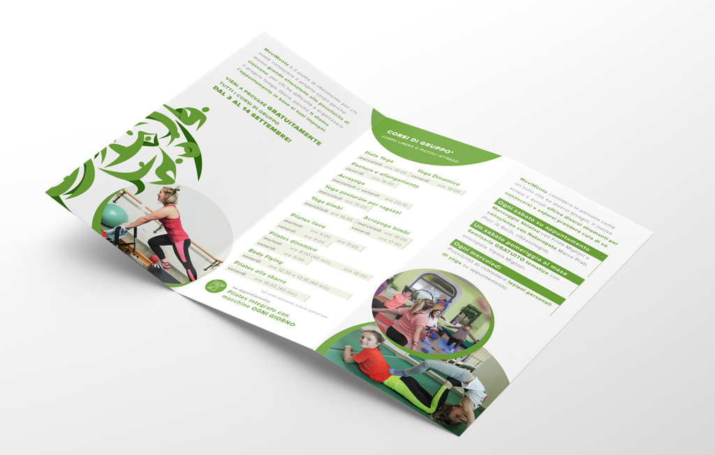
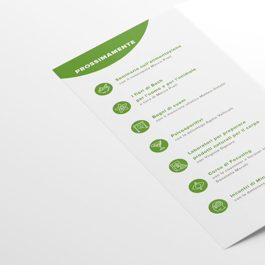
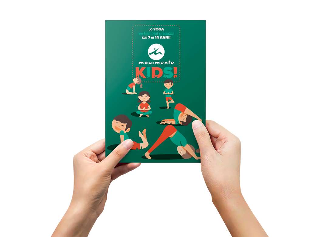
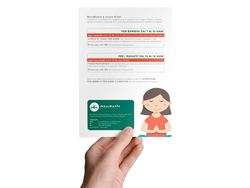
For these reasons we created a flier with all the courses held in her gym and an other one dedicated to Yoga for children. The first one has a very standard look following the logo’s style and linked to the institutional communication of Movimente. The second flier is way more playful, lighter but always linked to Movimente’s style.
Here is the kids flyer!
That’s it, I hope you liked it. Do sport.

