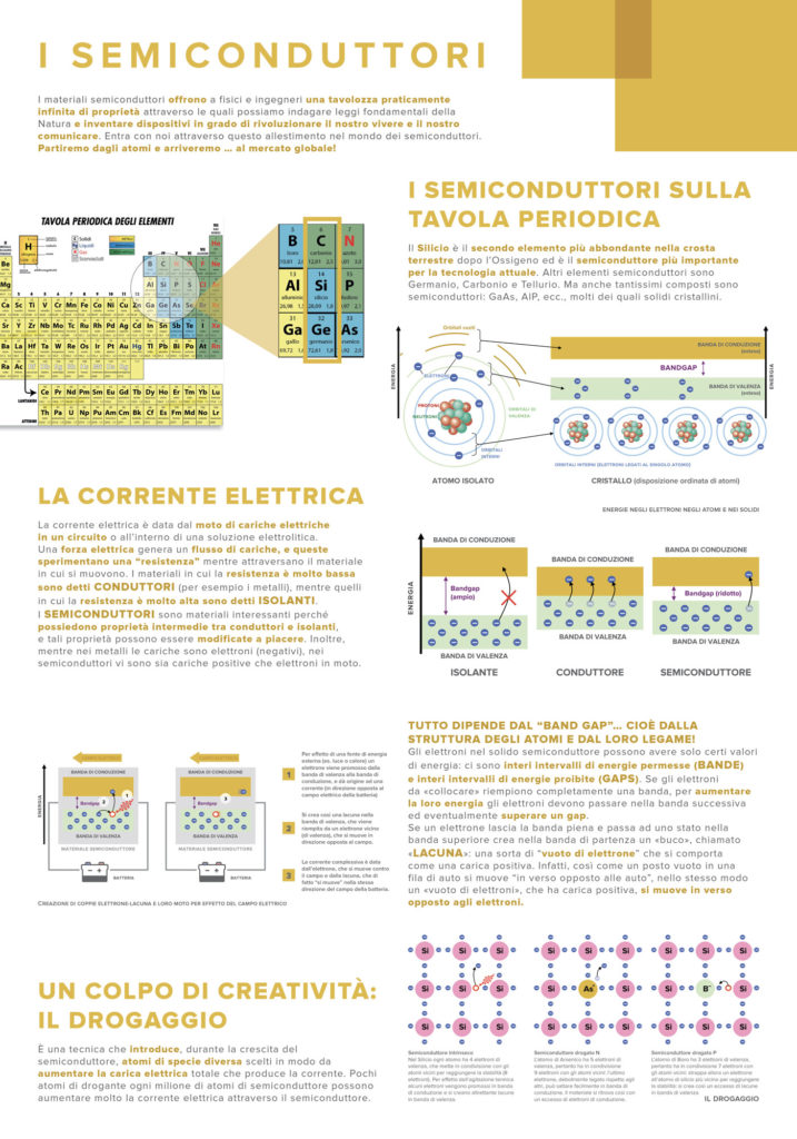
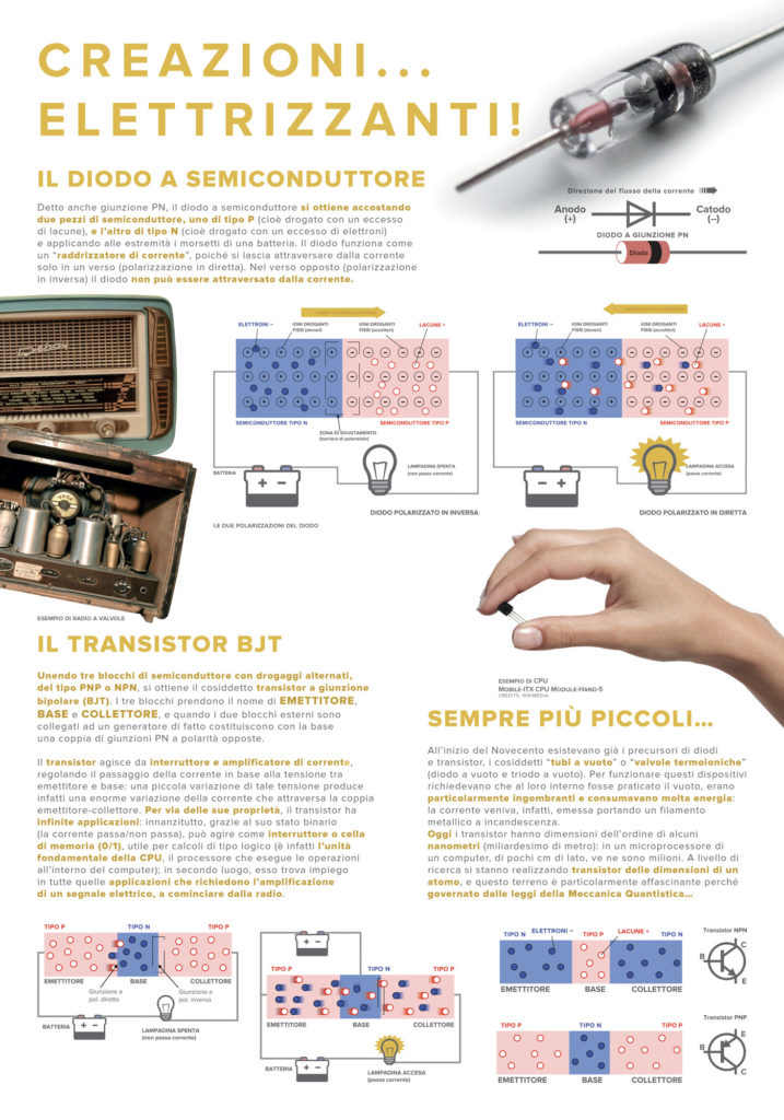
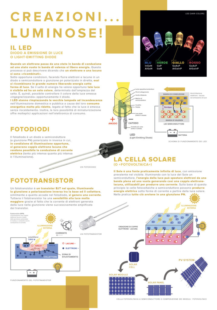
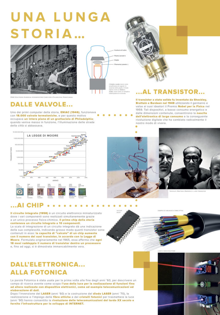
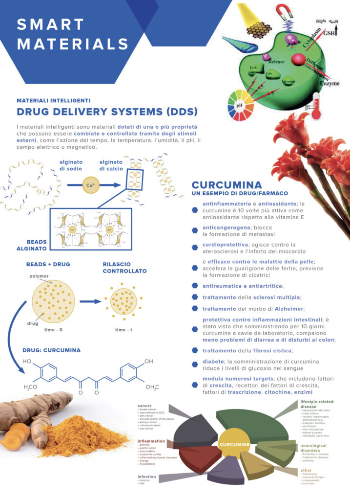
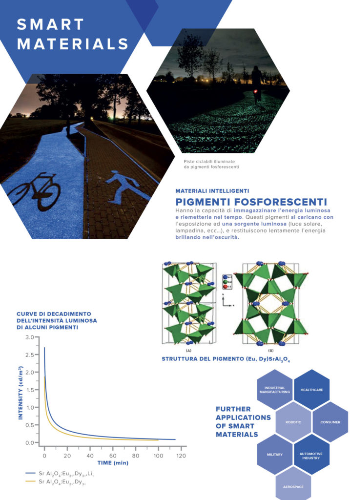
Working for libraries, universities, training institutions entails attention to details and an excellent scientific background. Above all, it means to redisign images as big as stamps in order to make my work decent. Otherwise it would look like a big Cubist painting made of huge pixels placed at random.
This is the premise that lead to Creative Science, an event conceived by the Delfini library of Modena, UNIMORE (University of Modena and Reggio Emilia) and Inco.Scienza, a divulgative scientific association to which I belong. I owe this opportunity To Inco.Scienza and thanks to it I’ve recently started to give my semi-concrete contribution to the world. I’m doing it by creating tragicomic graphic designs for its communication and trying to help the rest of the staff with the organization of the events.
However, the good side about this project has not been the number of my posters, but the great number of kids arrived in the library to approach science through small experiments and with a lot of curiosity. This is the main reason why two years ago I decided to devote myself to knowledge and ecology (while I’m writing this, I’ve just realized that I forgot the boiling water for the tea on the stove the entire afternoon, I’m sure God will take that into account).
Honestly, it feels really good to consider myself one of the responsible people for those kids’ curiosity, even if only to a very small extent. The idea of providing them with an instrument through which they can get a better understanding of the mystery of science, it is an incentive for me. It pushes me to think that I need to do something that goes beyond the mere beauty, something that can also combine itself better with the clarity of content.
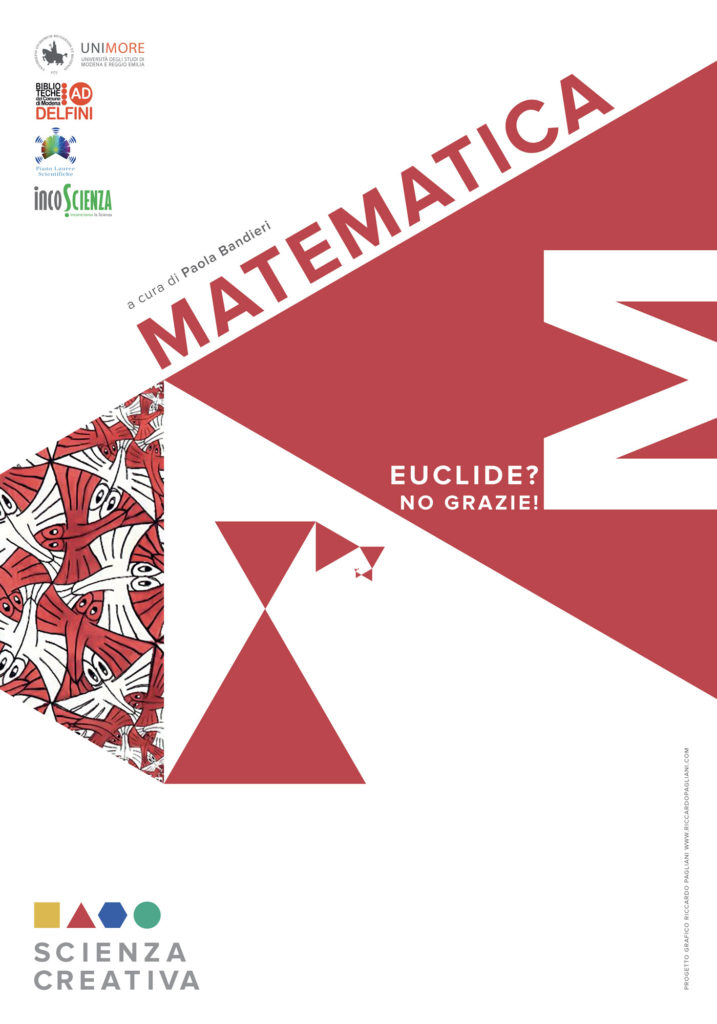
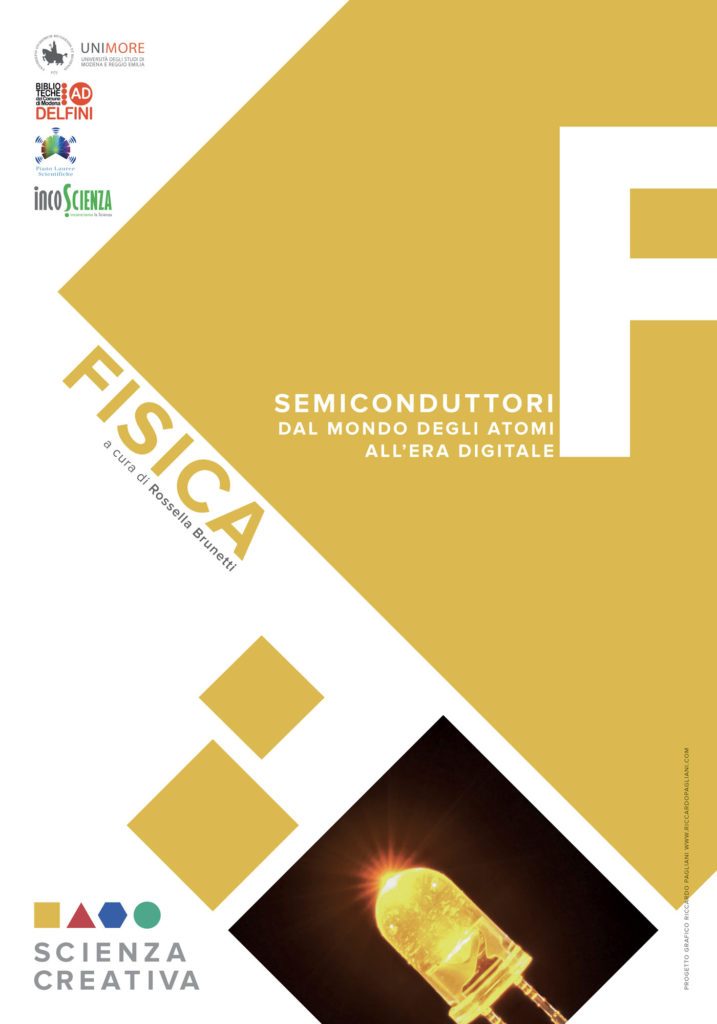
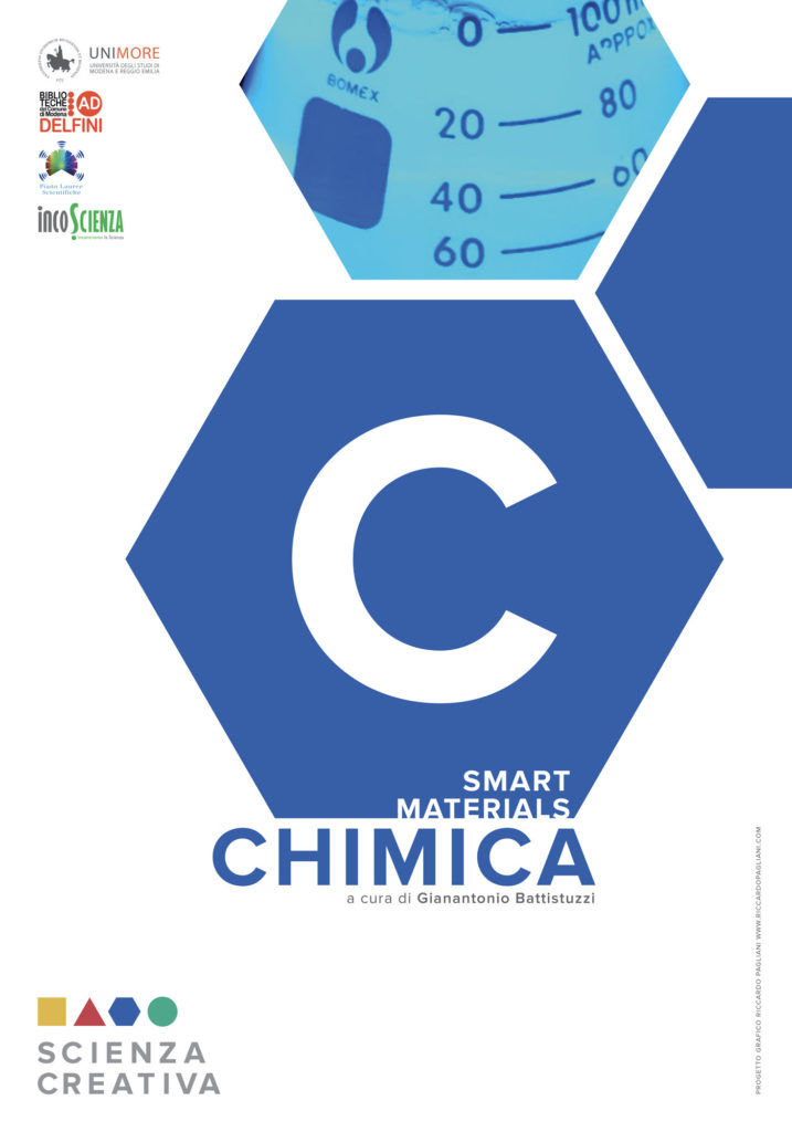
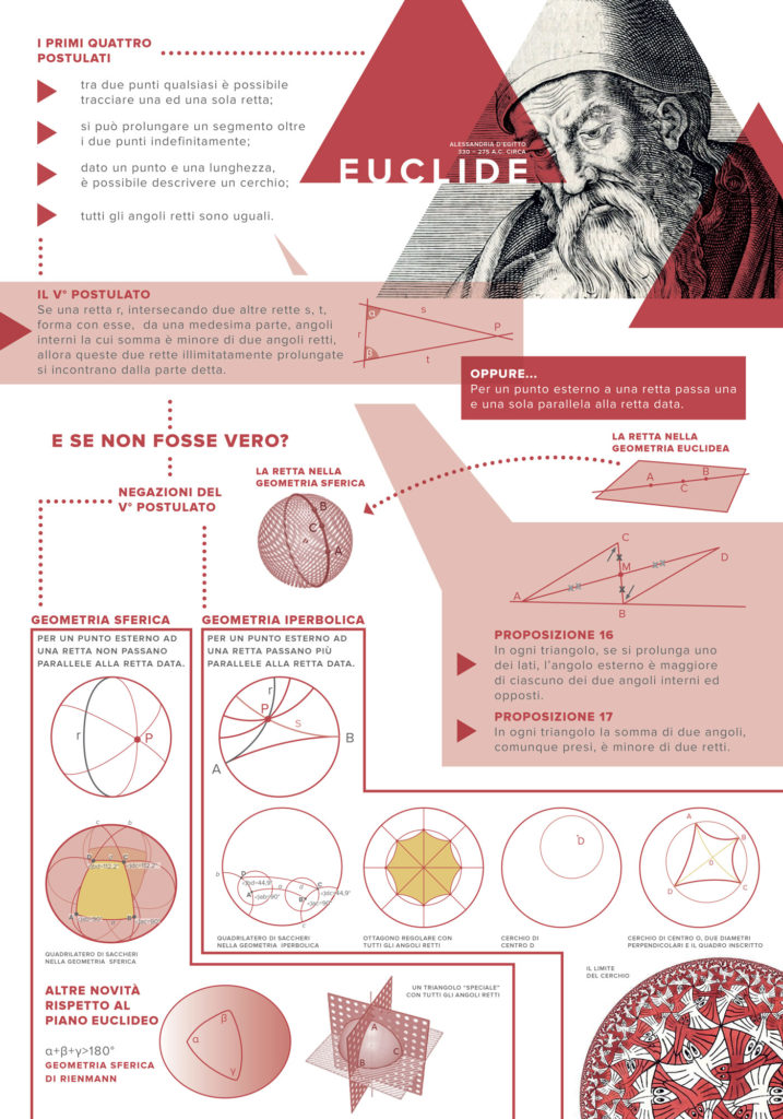
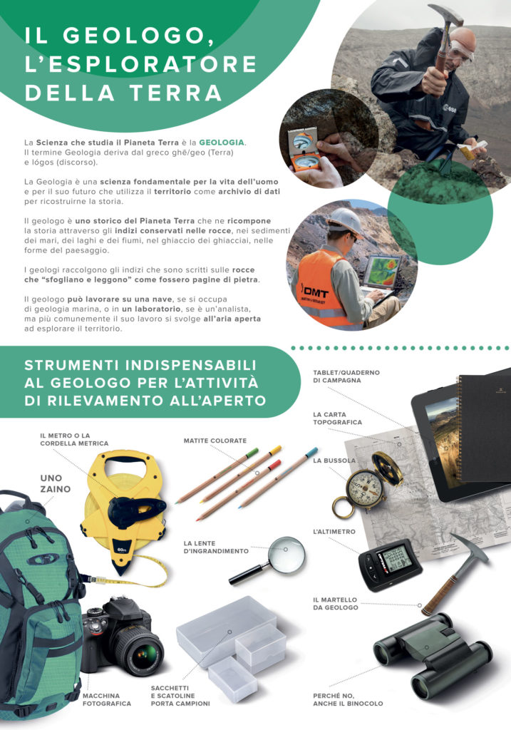
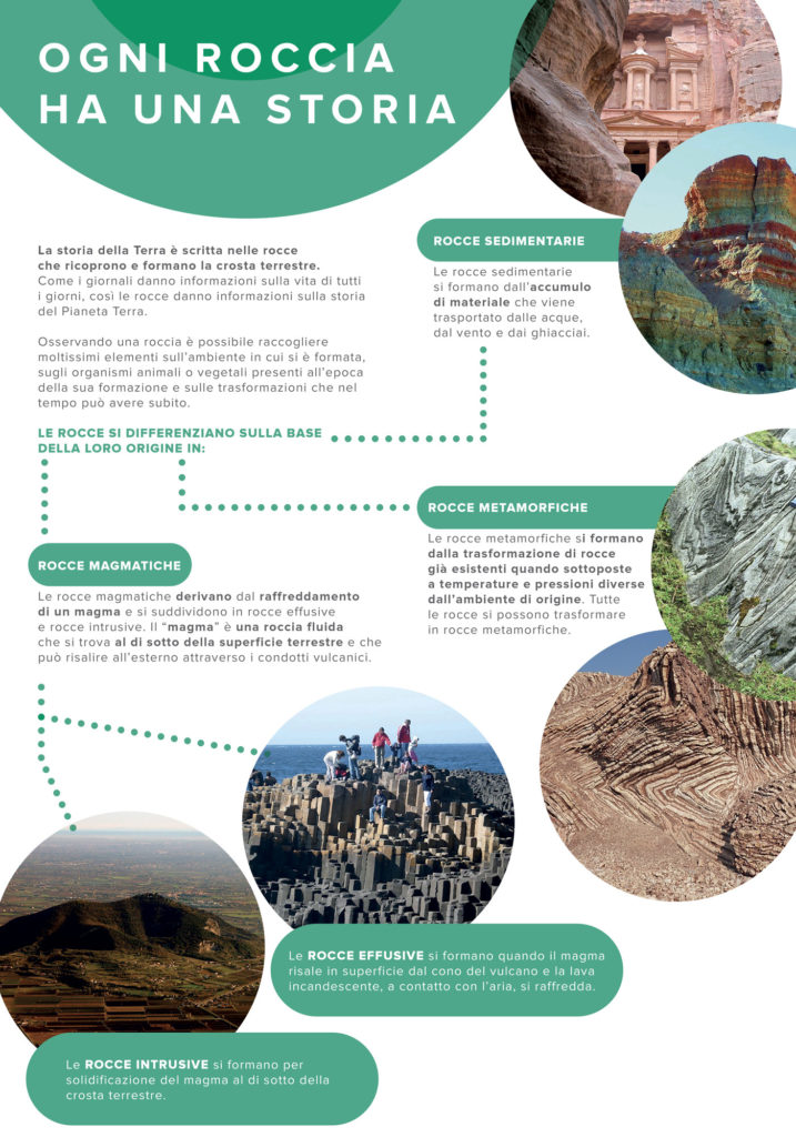
In order to do so, I tried to create posters that were very rich under a photographic point of view. Posters with detailed captions suitable both for university professors and for a target audience who is more used to see a concept rather than understanding it, an audience who is looking for visual clarity.
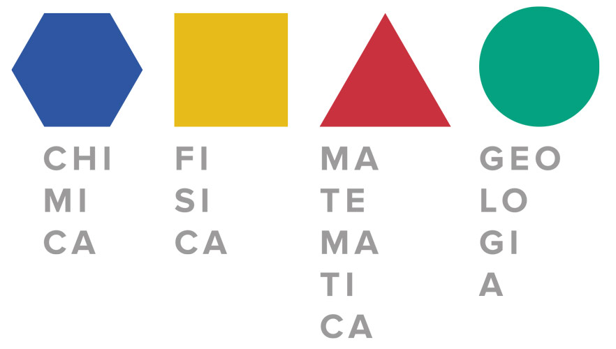
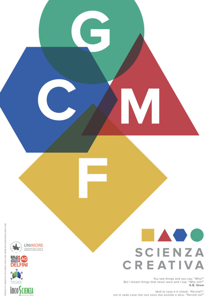
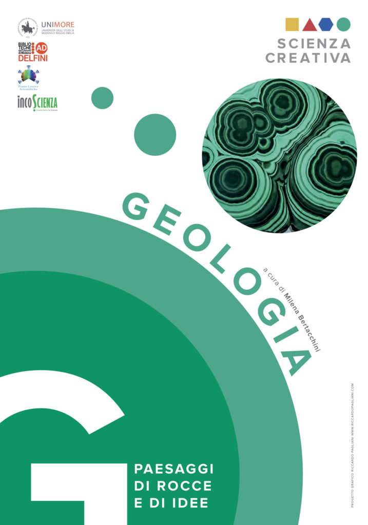
I worked on the abstraction in order to create the “logo” from which the entire visual identity of the event was developed. I looked for extremely simple shapes and colors in order to indicate the four disciplines of the event.
The further I got into this project, the more I realized how complex it actually was to plan the scientific communication for kids in a simple and comprehensible way. I also realized how difficult it was to give a pleasant look to all the contents I had to deal with. But in the end, I hope I succeeded in giving my contribution to ignite the spark of curiosity in the mind of these little devils called children.
