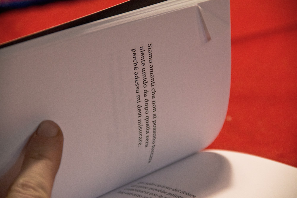
I want to show this little project because it’s a proof of how sometimes beauty can be something simple, functional and refined.
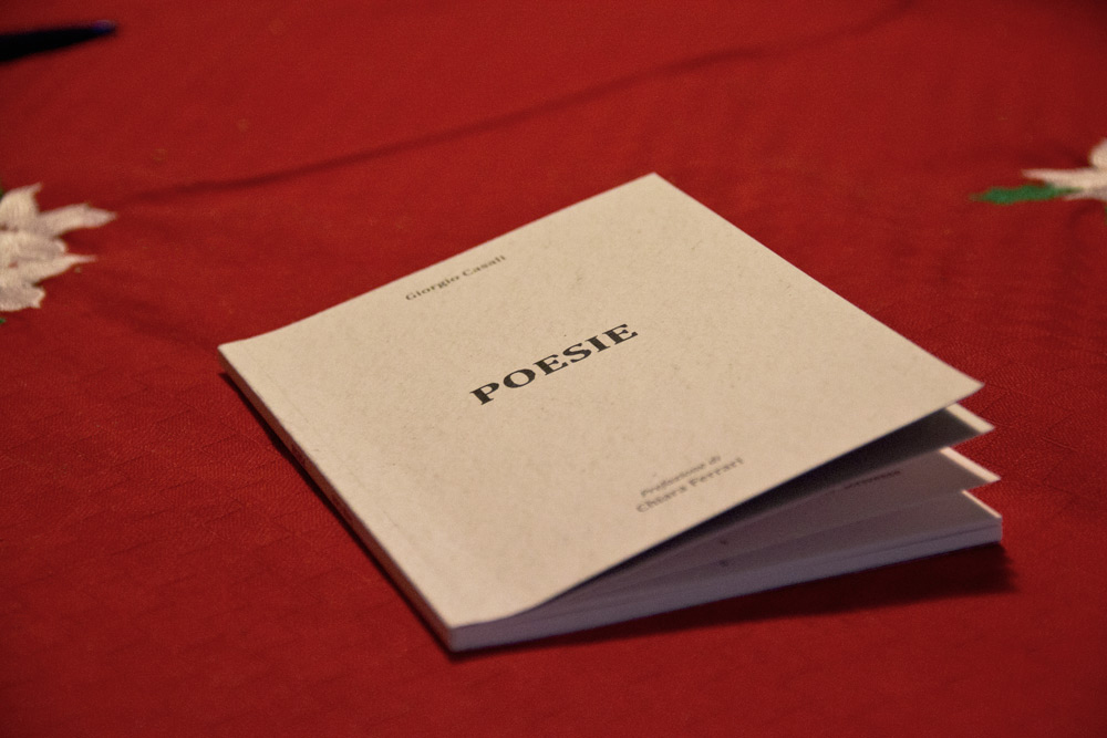
When you create a layout of a book of poems, the main difficulty is the discussion with the poet. The poet in this case is Giorgio Casali, who is very helpful and a lot of fun. But since he’s a poet, he knows very well what printing and self-producing a booklet means. It means attention to detail, ability to convey the emotions that the poet expresses through a few pages and words. In order to do so, it’s important that the graphic elements are in line with this thinking.
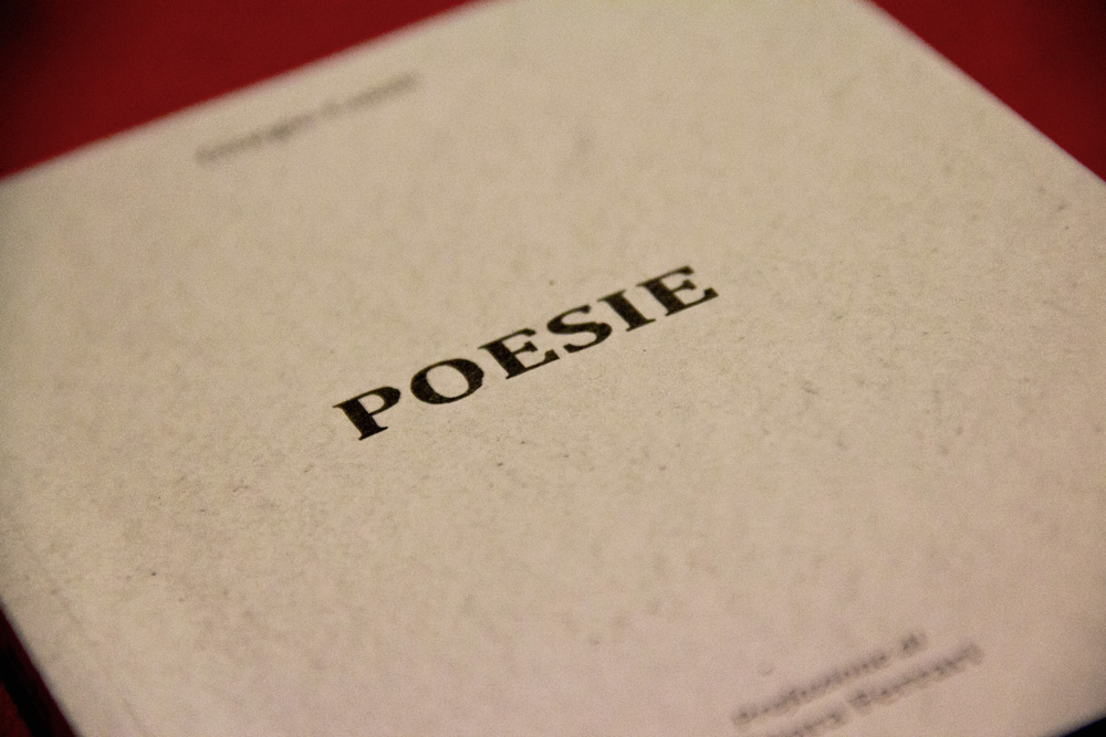
To begin, the cover was a success. No frills, a light texture on a white background with a slightly modified Cambria in the centre, in order to give everything a sober and refined look.
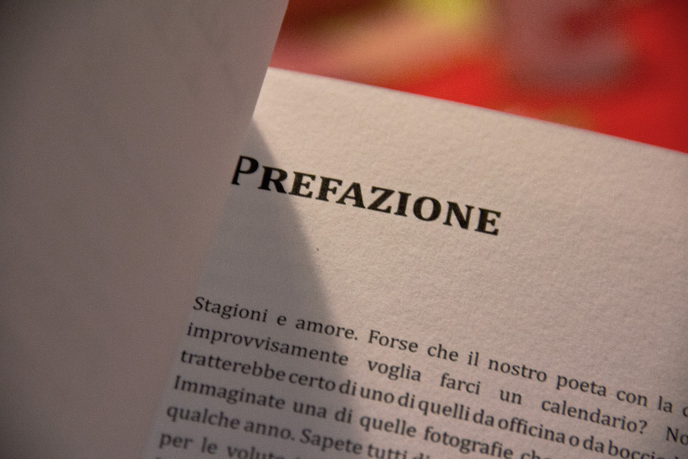
The negotiations about the size of the characters and the line-spacing of the texts and the preface reached a fair compromise. Giorgio was the mind behind the final touch about the kind of paper. 250 grams rough paper for the cover and 150 for the internal pages which gives the book a frugal and homemade look. The same idea that inspires the poems as well.
