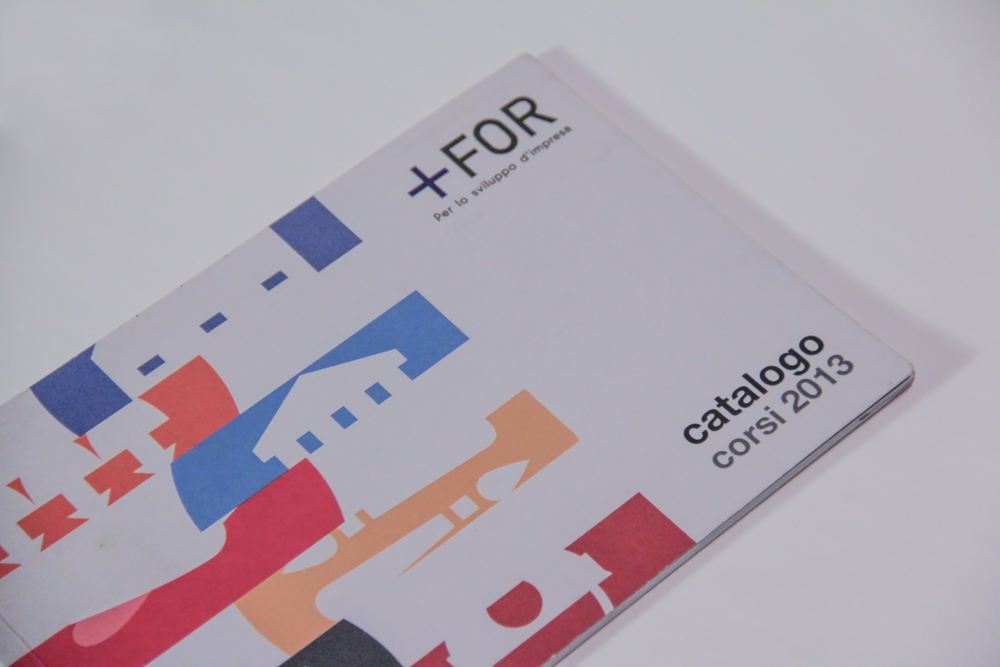
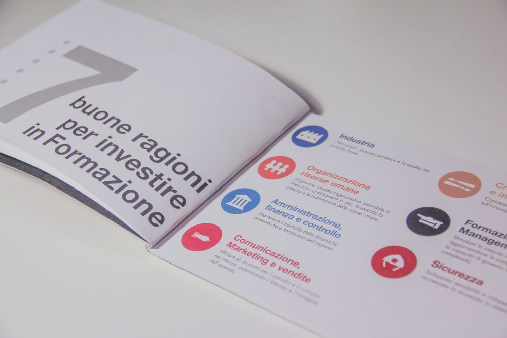
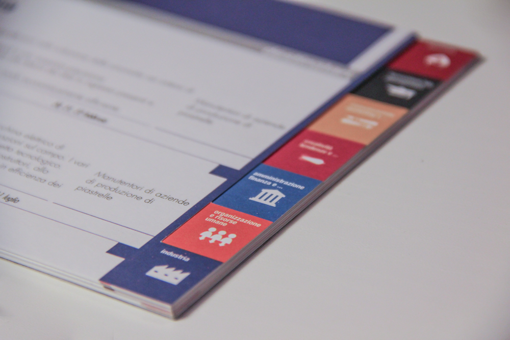
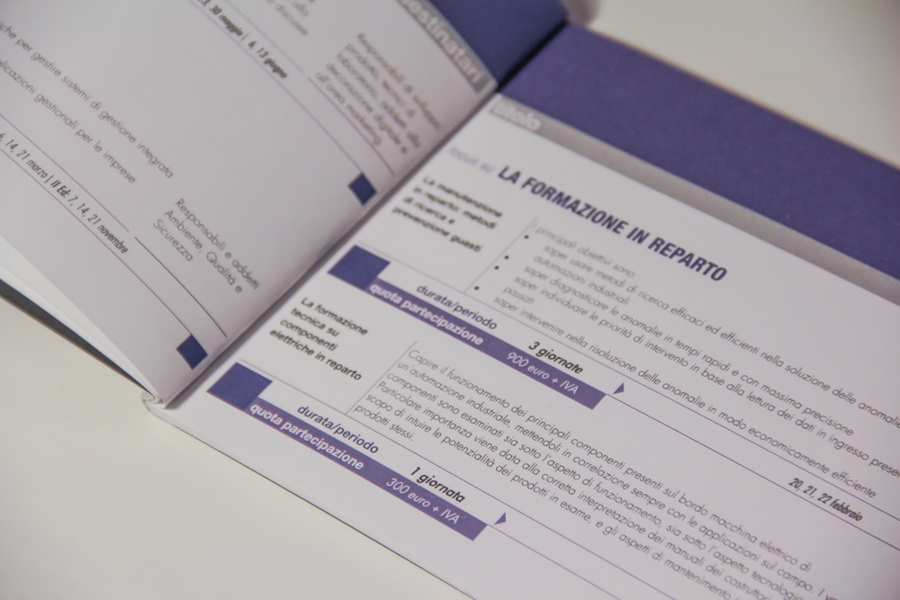
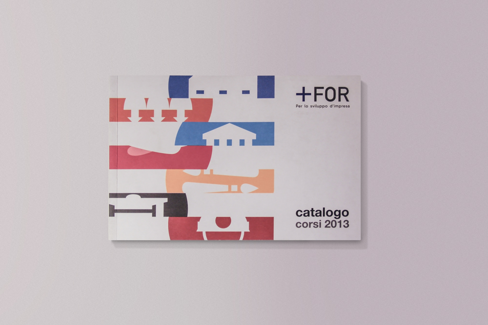
A project carried out with Ufo.Adv for Cerform back in 2013. There are two very interesting subjects: index and iconography. I was asked to reexamine a project which had be carried out previously with similar guidelines, but with an heavier graphic design. The fun part has been the association icon/color/category of studies, which has been followed by the graphic project of the explanatory charts for each course. I tried to give it an elegant but informal look, creating light and easily recognizable shapes.
The catalogue is small, perfect to be read and then kept in the bag without taking up space. Only a few essential colors connote its look, all of them referring to the different training services. This was done in order to garantee the reader maximum clarity when consulting this instrument.
