“I’ll be a pain in the ass for you” Giulio told me the day I ended up at University to talk about this trademark. Although I had a long experience of fussy customers behind me, I dind’t expect that I would redo a small red flame for at least twenty times or that I would have to review a circumference in all its details until I lost sleep, dignity, and desire to live. Nevertheless, I must admit that it has been pretty damn exciting. Because perfection and the search for synthesis of the concept push you to dig into your potential to bring out the concept at best and then a symbol, as a consequence.
This tree, in its apparent simplicity, encloses what BeeLAb is made of. Renewable energies linked to biomass coming from timber, a visual coherence with the logo of UNIMORE (reference university of this trademark) together with a set of colors that refers to the natural world.
To get this far, we started from a logo that recalled a bee, we could not find an email with some modifications for at least a month (damn Aruba!) and I spent days of dispair in front of a screen giving evil looks to illustrator hoping to take inspiration from it.
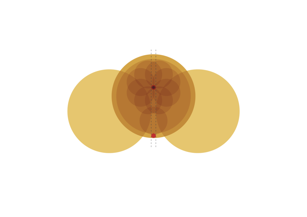
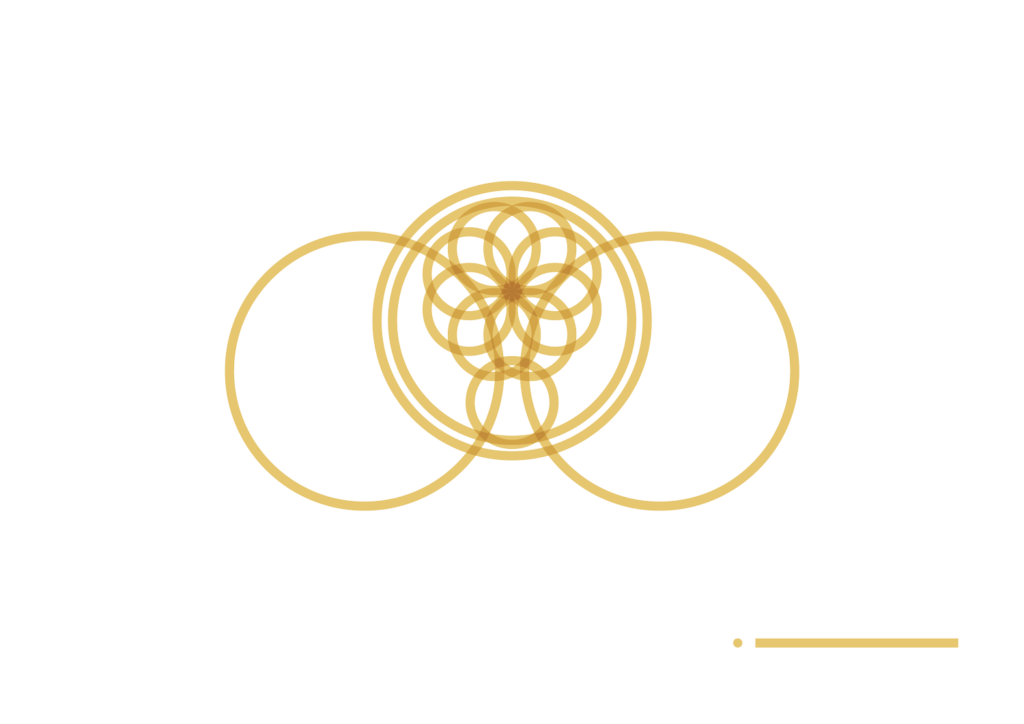
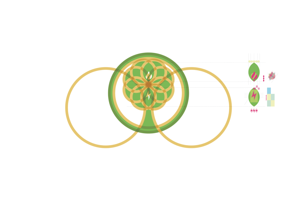
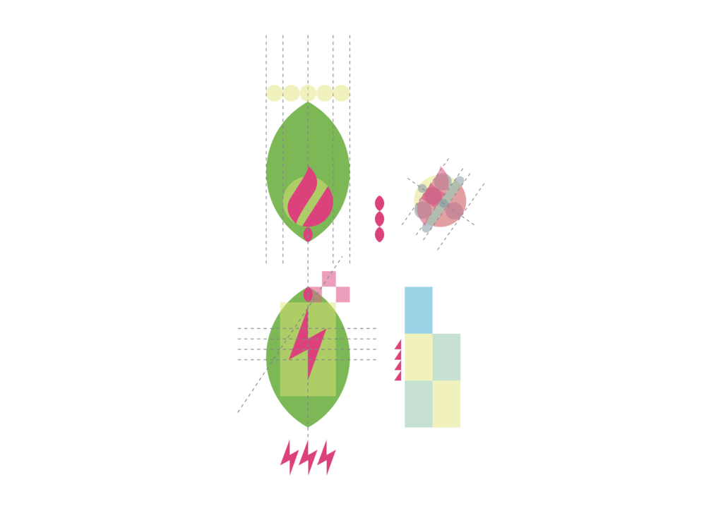
Following my first failure, I started working hard on the shape of the tree. I wanted to create something that reminded me of the Celtic symbols of life and rebirth. Something that was also linked to the concepts of electricity and fire, so important to the guys of beelab. Starting from the circle, I began to dig inside of it, trying to keep the dictates I started from, and this is what I obtained…
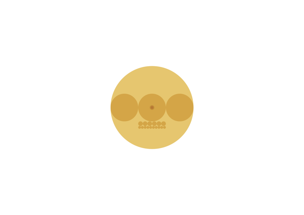
Everything starts from a circumference and its sub-multiples. All the shapes you’ll see from now on will be born from that circumference and its proportions.
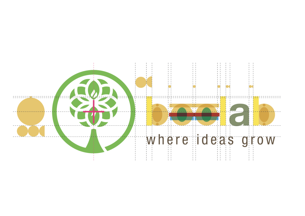
In my opinion, it’s interesting that a university lab decides to provide itself with a claim, which I suggested in a crazy moment of clarity. They liked it so much that it even survived the death of the first logo version, and now it’s an integral part of the final one… a small creative satisfaction!

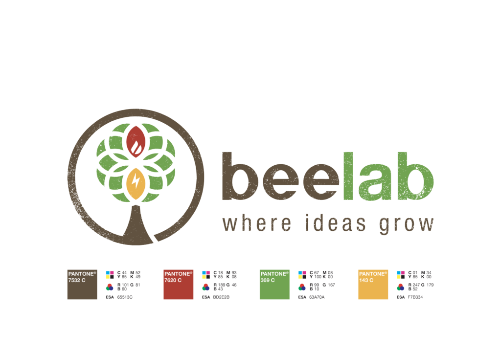
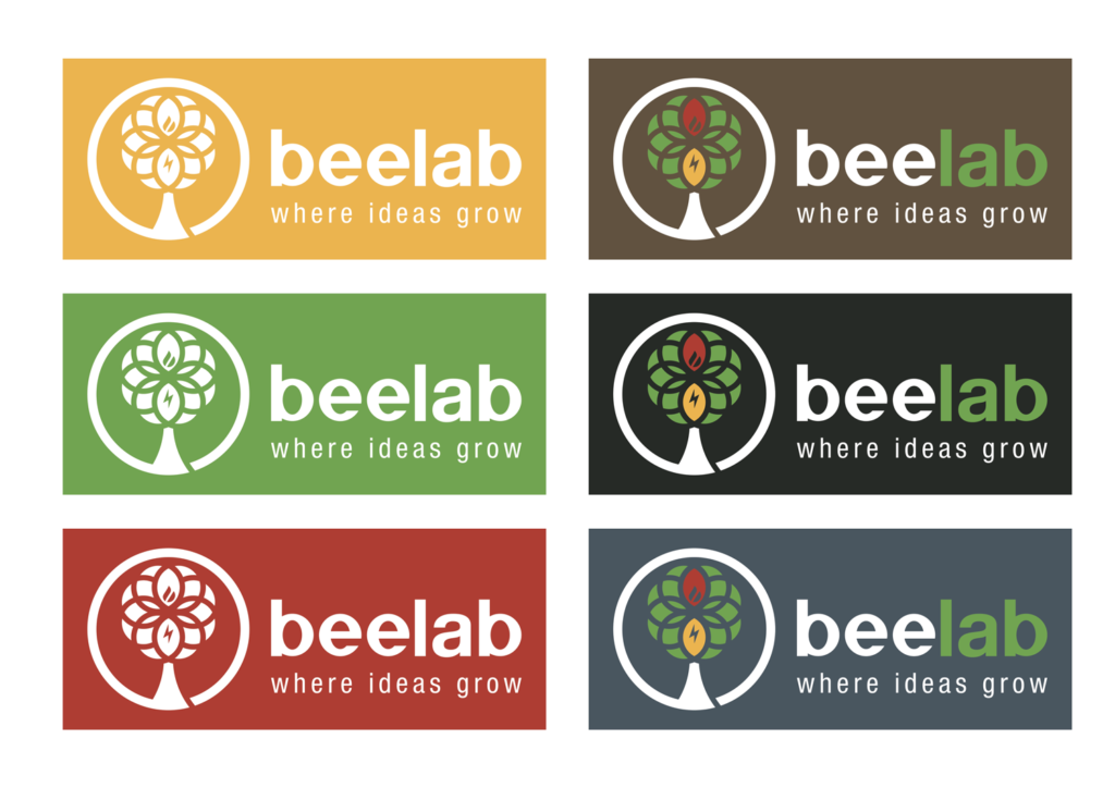
I will conclude with the variations of the trademark depending on the colored surfaces on which it’s applied. The negative (white) one is necessary on surfaces with colors that recall those present in the tree (green, red and yellow). For dark colors instead, it’s best to choose a semi-negative version in which only brown disappears.
